Armor Durability HUD Display
Modby Hooneybadgers
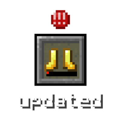
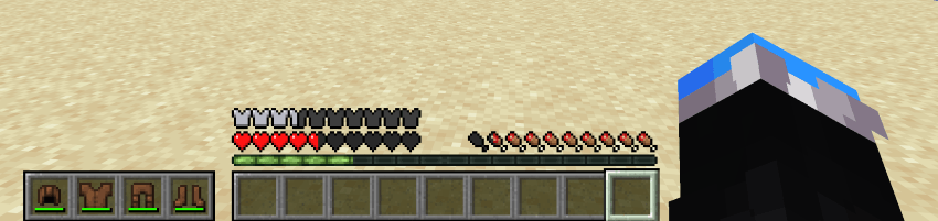
Vanilla style widget showing your armor and a low durability warning.
Type
Mod
CurseForge Downloads
47,033
CurseForge ID
1570638
Last Updated
Sep 28, 2026
Description
✨ Features ✨
A widget that displays your equipped armor
Low-durability warning icon appears before a piece breaks
Optional durability display
Four anchor positions
Multiple styles
Toggle on and off with a keybind
Fully configurable in game (Cloth Config)
Client-side only, works on any server
❓ FAQ ❓
Is this client-side?
Yes, install it on your client and it works on any server.
Do I need Cloth Config?
No, it just gives you the in game config screen. You can edit the JSON config directly.
Does it work on both Fabric and NeoForge?
Yes.
Can I add this to my modpack?
Yes.
⚙️ Configuration ⚙️
You can configure the mod using Mod Menu on Fabric and the mod list on NeoForge, or by editing the JSON file in the config folder. Powered by Cloth Config.
- "enabled"
- Master switch for this mod.
- Type: boolean
- Default value: true
- "anchor"
- Place that the HUD widget is attached to.
- Type: enum
- Possible values:
- "TOP_CENTER" — widget is placed at the top in the middle.
- "TOP" — widget is placed at the upper corner on the preferred side.
- "BOTTOM" — widget is placed at the bottom corner on the preferred side.
- "HOTBAR" — widget is placed to the side of your hotbar.
- Default value: "HOTBAR"
- "side"
- Side on which the widget is shown. If the widget is anchored at the top in the middle, this setting does nothing.
- Type: enum
- Possible values: "LEFT", "RIGHT"
- Default value: "LEFT"
- "offsetX"
- Offsets the widget on the horizontal axis. Positive numbers move it away from the anchor point, negative numbers move it toward the anchor point.
- Type: integer
- Default value: 0
- "offsetY"
- Offsets the widget on the vertical axis, otherwise the same as the X offset.
- Type: integer
- Default value: 0
- "vertical"
- If the widget should display vertically. Only applies to the "TOP" and "BOTTOM" anchors (it is ignored for "TOP_CENTER" and "HOTBAR").
- Type: boolean
- Default value: false
- "style"
- Defines how the widget slots are drawn. Try different styles and choose the one you prefer.
- Type: enum
- Possible values:
- "HOTBAR" — classic hotbar background.
- "ROUNDED_CORNERS" — hotbar background with rounded outer corners.
- "ROUNDED" — each slot fully rounded.
- "NONE" — no background.
- Default value: "HOTBAR"
- "durabilityDisplay"
- Controls how each item's remaining durability is shown.
- Type: enum
- Possible values:
- "BAR" — shows the vanilla durability bar only.
- "NUMERIC" — shows the remaining durability as a number.
- "PERCENTAGE" — shows the remaining durability as a percentage.
- Default value: "BAR"
- "widgetShown"
- Defines when the slots of the HUD widget are shown.
- Type: enum
- Possible values:
- "ALWAYS" — slots are always shown.
- "IF_ANY_PRESENT" — all slots are shown if at least one armor slot is not empty.
- "NOT_EMPTY" — only non-empty slots are shown.
- Default value: "NOT_EMPTY"
- "offhandSlotBehavior"
- Defines how the widget reacts to the offhand slot and attack indicator. Does nothing unless the widget is anchored at the hotbar.
- Type: enum
- Possible values:
- "ALWAYS_IGNORE" — widget never moves to make space for the offhand slot or attack indicator.
- "ADHERE" — widget moves away when the offhand slot is shown or the attack indicator is at the hotbar.
- "ALWAYS_LEAVE_SPACE" — widget always leaves space for the offhand slot even if it is not shown.
- Default value: "ADHERE"
- "pushBossbars"
- If the widget is in the top middle, bossbars will be pushed down by the widget.
- Type: boolean
- Default value: true
- "pushStatusEffectIcons"
- If the widget is in the top-right corner, status effect icons will be pushed down by the widget.
- Type: boolean
- Default value: true
- "pushSubtitles"
- If the widget is in the bottom-right corner, subtitles will be pushed up by the widget.
- Type: boolean
- Default value: true
- "reversed"
- Reverses the order of the armor items in the slots of the widget.
- Type: boolean
- Default value: false
- "iconsShown"
- Shows special icons in empty slots.
- Type: boolean
- Default value: true
- "warningShown"
- If enabled, a small warning appears at the slot of an item with low durability.
- Type: boolean
- Default value: true
- "minDurabilityValue"
- If the remaining durability of a displayed item is equal to or lower than this value, a warning is shown.
- Type: integer
- Default value: 10
- "minDurabilityPercentage"
- If the remaining durability of a displayed item is equal to or below this percentage, a warning is shown.
- Type: integer (0–100)
- Default value: 5
- "warningBobIntensity"
- Defines how quickly the warning icon moves up and down when shown. Lower numbers mean quicker motion. Set to 0 to disable the bobbing.
- Type: integer
- Default value: 3
🐛 Bugs & Support 🐛
Report issues on the GitHub issue tracker. Please include your modloader version, Minecraft version, and a latest.log.
❤️ Credits ❤️
Originally by BerdinskiyBear, forked by uku, made multiloader by AnAwesomGuy. Licensed MIT.
Recommended Gear
AffiliateHardware and extras that pair well with this mod.
As an Amazon Associate I earn from qualifying purchases.
Similar Mods

SCP-3199, Humans Refuted
An unknown creature that is almost impossible to stop due to its egg production
PowerConverters (Portablejim's fork)
Fork of Powercrystals' Powerconverters / Power Converters
no_moon.jar
This mod is a horror mod that slowly drives your world into chaos.
Pocket Tools
Tools you can fit in your pocket
Very Many Players (Forge)
A Forge mod designed to improve server performance at high playercounts.

Flan Fixes Botania
This mod makes Botania compatible with Flan